
Urban Tamaasha
RESEARCH. Stakeholder Interviews. Category Audit. IDENTITY. Naming. Tagline. Logo Design. Stationery. Packaging. EXPRESSION. Collateral.
Background
Urban Tamaasha was launching as a full-service fusion Indian restaurant with a wide ranging menu. It required a complete restaurant brand identity and brand collateral program to support its launch and position the brand as a fantastic establishment to eat and meet.
Challenge
The client needed to establish a brand from scratch which included the creation of a brand name, logo design, stationary, packaging, uniforms and collateral. In short the complete verbal and visual identity to position itself as a one of a kind Indian restaurant to stand apart in a the heavily crowded food and beverage category.


Action
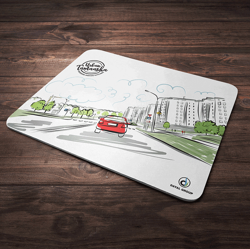
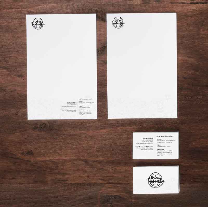
We started by coining the restaurant name as Urban Tamaasha. The Hindi word ‘tamasha’ means a grand show, performance, or celebration and was a close fit for the culinary experience the client stated would be doled out to customers. Next, we positioned the brand via the tagline ‘Modern Indian Kitchen’ to connote the spin on traditional Indian fare. The design of the logo was driven by the desire to make the brand really stand out in what is a bustling city setting, keeping in mind applications including signage. Our work also encompassed a total development of all brand collateral starting from business stationary and extending to menu design, table mats, chef uniforms, packaging and signage systems.
Result
Urban Tamaasha launched its first outlet on 100 Foot Road, one of the most urbane shopping thoroughfares in Bangalore. With signage that we consider easily grabs attention from the street level, footfalls to the restaurant exceeded expectations from the week one, and since then we hear that business has been brisk. Success often translates into growth, and a second outlet was launched within 12 months.