
The Asbury Group Integrated Technologies
RESEARCH. Stakeholder Interviews. Brand & Business Audit. IDENTITY. Logo Design.
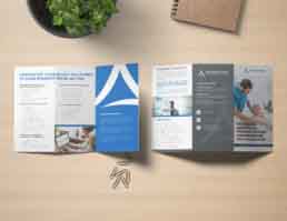
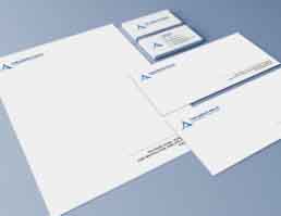
Stationery. Brand Guidelines. EXPRESSION. Collateral.
Background
The Asbury Group Integrated Technologies is the consulting arm of Asbury Communities Inc., America’s 15th largest non-profit system of continuing care retirement communities and related aging services. The organization has helped clients across the nation plan, implement, and operate technology solutions for their greatest challenges, as well as provided managed IT services.
Challenge
The client needed an identity refresh that was modern and moved it away from its parent brand – Asbury Communities Inc. The old logo was part of a design system that incorporated the parent brand’s mark sowing confusion amongst a large set of clients and limiting the company’s ability to project itself as an independent business apart from the parent brand.
Action
We designed a new logo made up of a symbol and word mark. Both elements combine synergistically to help project a completely separate entity from the parent brand. The symbol is crafted using three lines to represent the business’s strategic, tactical and operational excellence in integrating technology for senior living. It also represents the letter A, for the word Asbury. The typeface used is clean, confident and impactful with the colours blue and gray signifying professionalism, expertise, trustworthiness and stability. The re-design philosophy was captured in a set of brand guidelines, post which we worked to craft a new look and feel for key marketing collateral.
Result
The client implemented the new brand identity system across offline and online marketing assets. In addition to projecting a clean break from the parent brand the new logo also received marked appreciation from internal and external stakeholders.