
MyAppTap
RESEARCH. Stakeholder Interviews. IDENTITY. Logo Design.
Background
MyAppTap approached us as a mobile app development company targeting medium and small enterprises with the vision to solve the challenge of creating, customizing and delivering apps for this segment. The key proposition offered was that apps developed by it would be easy to create, highly customizable and extremely economical.
Challenge
The key challenge was to create a highly unique design for the brand identity in order for it to stand out from the crowd. Furthermore we needed to effectively capture the essence of the businesses’ core competency of delivering a wide variety of customizable apps in creative fashion.
Action
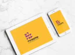
We designed a logo inspired by the creative art craft form of origami. Eye-catching, abstract and sophisticated, the design ‘spells out’ MyAppTap in the negative space. It was crafted to represent intelligent design, with the origami inspired symbol connoting simplicity, beauty and customization.
Result
The client approved and adopted the logo based on the design aesthetic as well as design thinking. A key metric in the selection of this logo was the fact that it was highly unique and stood apart from those of competitors.