
Juicy Momos
RESEARCH. Stakeholder Interviews. IDENTITY. Logo Design. Stationery. Packaging EXPRESSION. Collateral. Environments.
Background
Juicy Momos was launched as an up-and-coming fast food franchise business. Post launch, the management team believed the visual brand identity lacked in terms of design and aesthetic.
Challenge
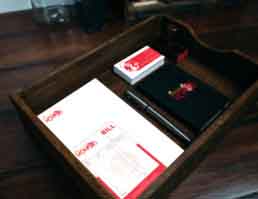
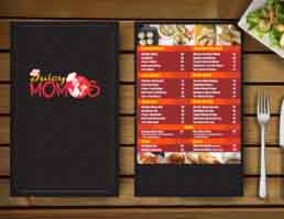
An unsettled colour scheme made the brand’s logo reproduction unclear when applied across applications including retail kiosks and brand collateral. Furthermore the brand needed to re-develop several items of brand collateral ranging from visiting cards, menu designs, packaging and more.
Action
We redefined the colour palette of the brand’s logo by enhancing balance and contrast. This simultaneously allowed for continuity of brand recognition by customers, while avoiding the need for trademark re-registration. Psychology of colour principles were used in adopting red and yellow as the primary colours of the rebranded entity. The re-designed identity was used to develop a range of brand collateral including menu cards, take-away packaging and staff uniforms.
Result
Juicy Momos has managed to continue its journey of growth at a steady pace. Since the rebrand, the company has continued to expand both their B2C and B2B markets.