
Cocoes Wellness
RESEARCH. Stakeholder Interviews. Category Audit. IDENTITY. Logo Design. Brand
Guidelines. Corporate Identity Kit
Background
Cocoes Wellness was launching as a company specializing in food products made of coconut derivatives. Its first planned product launch was extra virgin coconut oil, known for its health and skin benefits. It also planned later expansion into coconut flour, coconut milk, coconut water, coconut v coconut confectionery products, amongst others.
Challenge
The key design challenge was to craft a beautiful modern identity void of literal and traditional associations at the request of the client, as many in-category brands were already doing this. We were specifically asked not to use coconuts as part of the design strategy as this as cliché.

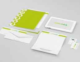
Action
We crafted a logo fashioned as a stylized word mark. The negative space in the first C was modified to resemble a drop of oil – in line with th comp y’s first product launch. The lettering was clean and minimalist and the predominant colours were green and yellow. We also developed brand guidelines and designed a corporate identity kit comprised of a visiting card, letterhead and envelope.
Result
The client was approved and was happy with the brand identity as it conformed to the brief, keeping all specific inputs in mind. The logo is to be rolled out on all brand and packaging elements of the Cocoes Wellness brand.