
Ingu Tengu
RESEARCH. Stakeholder Interviews. Brand & Business Audit. Competitive Analysis. IDENTITY. Logo Design. Stationery. Packaging. EXPRESSION. Environments.
Background
Ingu Tengu is an Udupi cafe started by the same family that gave Bangalore its iconic breakfast haunt, Brahmin’s Coffee Bar. It follows a proud, five decade heritage of serving South Indian vegetarian fast-food to Bangaloreans. The name comes from the old Kannada saying that with the help of Ingu (asafoetida) and Tengu (coconut), even a monkey can cook.
Challenge
Ingu Tengu was launching its first outlet and needed to create an identity, environment and messaging steeped in its rich tradition of serving quality food, but also one which had adapted to a new and more contemporary avatar. The Udupi fast-food model being common in Bangalore meant that there needed to be a strong element of brand differentiation to set Ingu Tengu apart from its competitors.

Action
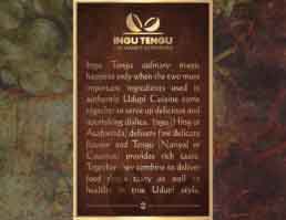
We started by establishing the most important pillars of the brand: rich heritage, fresh natural ingredients and clean cooking processes. Next, we created a logo inspired by the colours of the key ingredients present in the majority of dishes – Ingu and Tengu. This was followed by an environment design that ensured the establishment’s look and feel communicated key messaging in the form of an engaging brand story. The final touches came to life across brand collateral including menu cards, packaging, placards and signage complementing a brand that stands for taste, tradition and quality.
Result
Ingu Tengu launched successfully and is a landmark in its neighbourhood attracting throngs of hungry Bangaloreans every day. Patrons not only savour the delicious and healthy food, but are also frequently spotted appreciating the cool brand design that appeals to traditional sensibilities with a modern twist.