Essel Propack
RESEARCH. Brand & Business Audit. Competitor Analysis. Focus Groups. STRATEGY. Essence. Positioning. Values. Architecture. IDENTITY. Naming & Tagline. Logo Design. Stationery. EXPRESSION. Brand Collateral. Integrated Communications. Corporate Video. DIGITAL. Web Design & Build. Social Media. MANAGEMENT. Brand Guidelines.
Background
Essel Propack Limited (EPL), part of the $2.4 billion Essel Group, is the world’s largest tube packaging company. The company supplies packaging solutions for Oral Care, Cosmetics, Pharmaceuticals, Food, and other industries. EPL employs over 2,700 people worldwide and has 25 facilities across 12 countries.
Challenge
EPL had quickly risen to become the leader in tube packaging solutions globally. However, like many B2B enterprises, it had overlooked the creation of a distinctive and impactful brand. Over time, this oversight became a liability, limiting EPL’s ability to effectively project itself as the pioneering powerhouse it truly was. Consequently, the company’s ability to attract new customers declined and EPL needed a comprehensive brand overhaul and a large-scale brand building exercise to place it on the pedestal it deserved to stand on.
Action
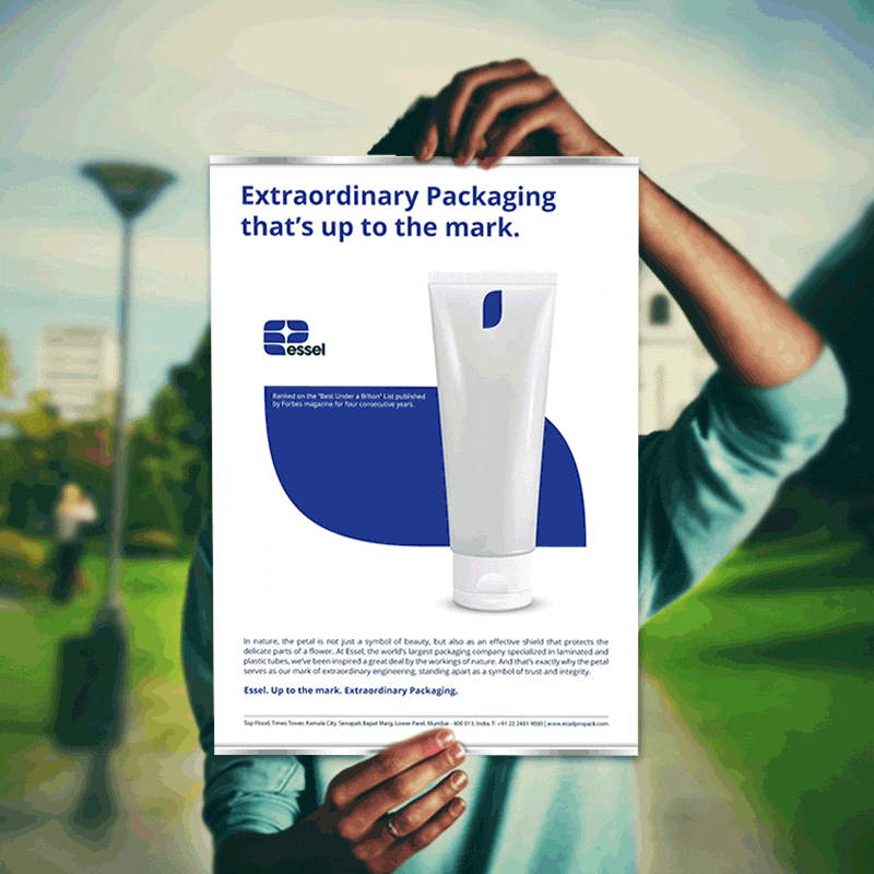
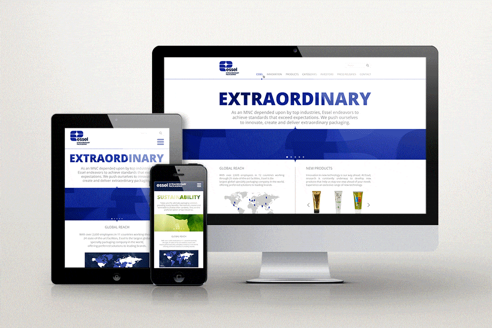
The EPL rebrand kicked off with meticulous research, encompassing interviews with over 100 employees, 25 customers, and 50 end-consumers. These interviews were conducted to gauge both internal and external perceptions of EPL’s brand. Findings from our research served as the bedrock for crafting a highly relevant brand strategy, encapsulated in the succinct and impactful brand essence: “Extraordinary Packaging.” We then progressed to crafting a well thought through design strategy that resulted in an iconic new brandmark which resembles an ‘e’ for Essel. This distinctive logo is ingeniously composed of five elegant ‘petals’, each symbolizing a core business vertical that the company serves. To maintain brand consistency, we placed the entire branding system in comprehensive brand guidelines. With the brand DNA in place, we moved on to the strategic development and execution of a 360-degree brand amplification exercise that including print advertising, marketing collateral, a corporate global video, and a wide range of other branding assets. Simultaneously, we worked to create a new global website including complete content development, page designs, and SEO. As our journey with EPL blossomed, we were entrusted with brand management across social media platforms including Facebook, LinkedIn, and Twitter.
Result
Our work to rebrand and present EPL in new light surpassed all expectations, becoming a resounding blockbuster success. The new EPL brand was unveiled globally to stakeholders including employees, partners, customers, investors, and the media during an international townhall-style meeting. Our efforts yielded over 100,000 followers for EPL across social platforms. Historical analysis of EPL’s share price during our association clearly shows appreciation of up to 250% of its stock value following our rebranding effort.